Why Is Your Layout Still Fighting the 'Ghost Space' Inside Your Text Boxes?
Stop using brittle negative margins to align your typography and discover how the new text-box-trim property finally solves vertical alignment.
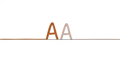
We’ve all been there: you’re staring at a high-fidelity Figma file where the top of the "H" in a heading perfectly kisses the edge of its container, but when you translate it to CSS, there’s a mysterious 4px gap staring back at you. You try to fix it with a cheeky margin-top: -4px, but then you change the font-family or the line-height, and suddenly your layout is a house of cards ready to collapse.
That "ghost space" isn't a bug; it's the inherited legacy of physical typesetting. But after decades of hacks, we finally have a real way to kill it.
The invisible box we didn't ask for
In the world of CSS, when we set a line-height, the browser distributes that extra space equally above and below the characters. This is called "leading." If your font size is 16px and your line-height is 1.5 (24px), you’ve got 4px of empty space sitting on top of your capital letters and another 4px hanging out below the baseline.
Designers hate this. Developers tolerate it until they have to align a big hero title with a sidebar or a button icon.
Historically, we’ve handled this like barbarians:
/* The "Please Don't Break" Hack */
.hero-title {
  font-size: 4rem;
  line-height: 1.1;
  margin-top: -0.15em; /* Eyeballed until it looked 'okay' */
}
This is brittle. If the user’s browser loads a fallback font, your negative margin might chop off the top of the letters. It’s a game of "Guess the Pixel" that nobody wins.
Enter text-box-trim
The W3C finally heard our cries and introduced the text-box-trim property. It does exactly what it says on the tin: it trims the excess space from the top and bottom of the text box.
Instead of fighting the leading, we just tell the browser to discard it for the edges of the container.
.modern-heading {
  line-height: 1.5;
  text-box-trim: both;
  text-box-edge: cap alphabetic;
}
By setting text-box-trim: both, you’re telling the browser to lop off the leading from the first and last lines of text in that element. The space *between* the lines remains intact, preserving readability, but the outer "ghost space" vanishes.
But what are we actually trimming?
You can’t just say "trim it" without telling the browser where to stop the scissors. That’s where text-box-edge comes in. This property defines the bounds for the trim.
Most of the time, you'll want to use cap for the top (aligning to the top of capital letters) and alphabetic for the bottom (the baseline).
h1 {
  /* Trim the top and bottom */
  text-box-trim: both;

  /* Top edge = Cap height | Bottom edge = Baseline */
  text-box-edge: cap alphabetic;
}
If you’re working with a font that has massive descenders (like the tail on a 'g' or 'y') and you don't want them getting clipped or hitting the edge of a button, you might use ex or text instead.
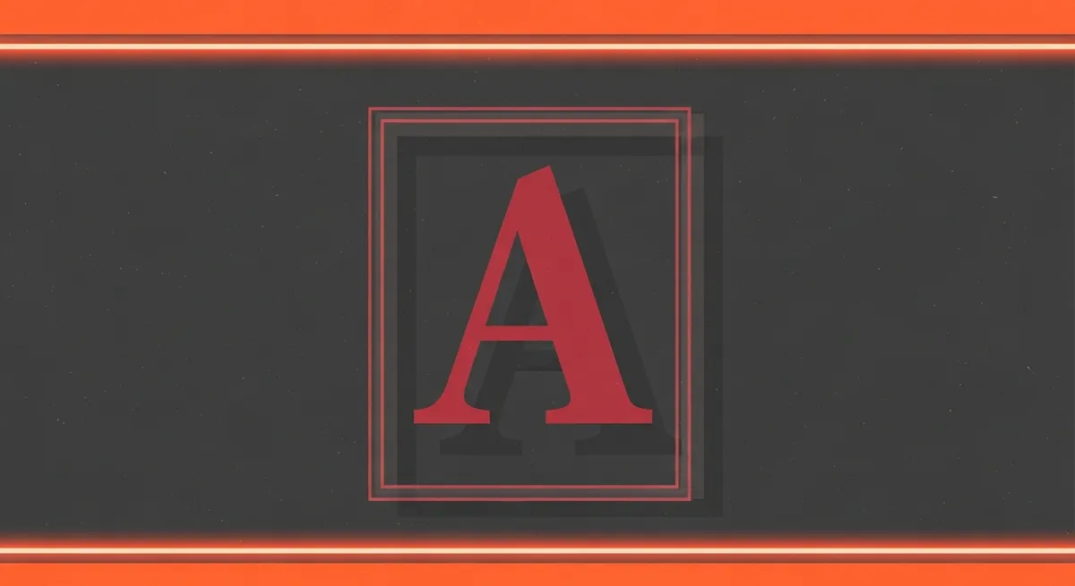
A real-world example: The Pixel-Perfect Button
Buttons are notorious for looking vertically off-center, especially when icons are involved. We usually fix this with display: flex and align-items: center, but even then, the text often looks like it's "sinking" because of the baseline.
Using the new spec, we can make the text box actually match the height of the letters:
.btn {
  display: inline-flex;
  align-items: center;
  padding: 12px 24px;
  background: #007bff;
  color: white;

  /* This ensures the button height is derived from
     the actual caps, not the hidden leading */
  text-box-trim: both;
  text-box-edge: cap alphabetic;
}
This makes the button's internal spacing feel much more intentional. I've found that using this on UI components removes that "vague floaty feeling" where things are mathematically centered but optically wrong.
The "Gotcha" (Browser Support)
I’d love to tell you to go refactor your entire codebase right now, but we’re in the "early adopter" phase. Safari (starting with 18) and Chrome (131+) have started shipping support for these properties. Firefox is trailing a bit behind, but it's on their radar.
Because this is a layout-enhancing feature, you can use it today as a progressive enhancement.
.content-block h2 {
  font-size: 2rem;
  line-height: 1.4;
}

/* Only apply if supported */
@supports (text-box-trim: both) {
  .content-block h2 {
    text-box-trim: both;
    text-box-edge: cap alphabetic;
    margin-top: 20px; /* Now this 20px is actually 20px! */
  }
}
Why should you care?
It’s about control. For years, web typography has felt like trying to paint a masterpiece while wearing oven mitts. We’ve had to account for space we couldn't see and couldn't easily manipulate.
text-box-trim moves us away from "voodoo CSS" (magic numbers and negative margins) and toward a system where margin-top: 20px actually means "20 pixels from the top of my text." It makes your components more reusable, your layouts more predictable, and your designer a whole lot happier.
Give it a spin in a latest-version Chrome or Safari browser. Once you see your text actually sitting where it's supposed to, it’s hard to go back to the ghost space.